SPAM
These four letters are the nightmare of every email marketer.
How to avoid getting into this darkest pit of online oblivion?
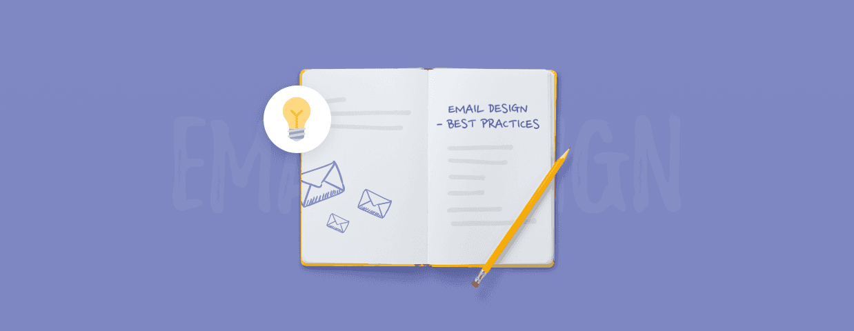
Master the art of effective email design.
In this article, we’ll show you:
- How to design emails your readers will be dying to get
- 15+ email design inspiration ideas from all over the web.
- Tips on how to make the most of the messages you send
Generate leads for your well-designed emails
First things first—
Look at this stunning email design from Apple.
(You’ll know how to do the same by the time you’re done with this post).
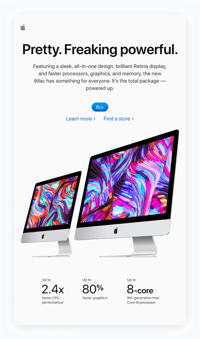
This message from Apple could be the benchmark for modern email design:
- White space to keep the focus on the product
- Perfectly aligned, positioned, and easy-to-read content
- Copy focused on the benefits for the user.
And—
Email designs like these sell.
The best part?
You don’t have to have Apple’s budget to design high-converting, stunning emails. Stick to these email design best practices, and make people want to read your messages.
Email Design Best Practices
Below, we’ve put together an extended list of some of the best practices to make your emails nothing short of captivating.
1. Email Preview in the Inbox
Email preview is the first moment when you can draw the recipients’ attention.
Combined with compelling copy, proper preview design can convince them to open the message.
The preview consists of three parts:
- Email Sender Name
- Email Subject Line
- Email Preview Text
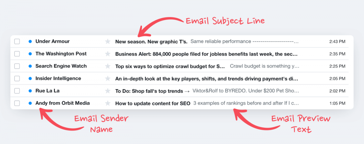
Email Sender Name
This shows who sent the message. Use the name of your company, your own name or the name of whoever is responsible for email marketing. In some cases, it could be a campaign type, e.g., “Tidio Newsletter.”
Limit the sender name to 20 characters. This way, you can be sure it will always appear in full length on the recipient’s screen.
Email Subject Line
Keep your email subject lines under 50 characters. This length ensures a full display on all types of screens.
Email Preview Text
Add a message that “reinforces” the subject line by providing more context. How long should an email preview text be? Between 40 and 70 characters.
Need ideas for attention-grabbing subject lines to recover sales? Here’s the abandoned cart subject lines guide for ideas.
2. Email Template Design
The emails you send must be both visually attractive and easy to navigate.
It all starts with choosing the best template layout:
- Single-column
- Multiple-column
- Hybrid.
Single-Column Email
Contains one or multiple content sections, each filling the width of the email.
Such a layout is perfect for focusing the recipient’s attention on an offer or a single piece of content.
Benefits of a Single-Column Email Design
- Suitable for viewing on mobile.
- Perfect for sharing offers.
- Works well for sharing announcements and updates.
Multiple-Column Email
This email design practice puts the content into two or more columns.
In this example, there are four columns to showcase more products from a new collection of clothes.
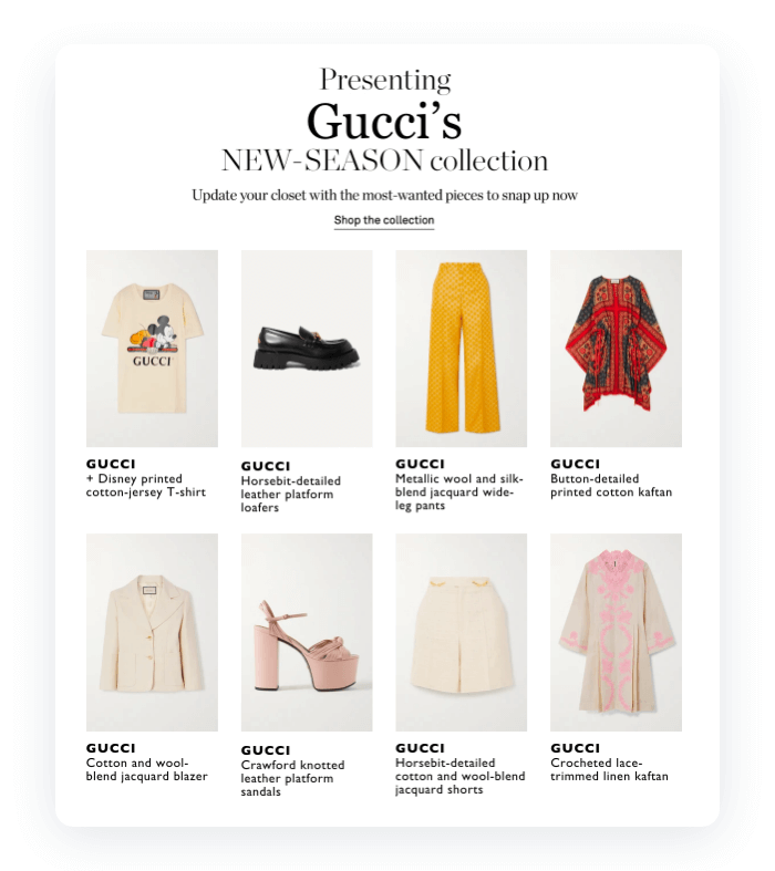
Benefits of a Multiple-Column Email Design
- Perfect for displaying product galleries.
- Makes it easier to organize content.
- Allows adding multiple links to your website.
Hybrid Email
The hybrid email design combines the two previous email types. It contains a single column on the top and multiple columns below.
Consider this email from H&M. There’s a big header image on the top that emphasizes the main message—discount + free shipping.
What follows are different columns in a row. They’re website sections to make it easier for the customer to get where they want.
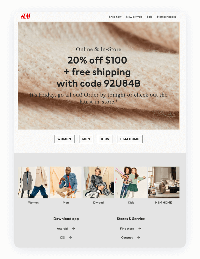
Benefits of a Hybrid Email Design
- Suitable for sharing diverse content.
- Provides many opportunities to add CTAs.
- Allows focusing attention on a single content piece.
3. Email Visuals & Animation
Images and animations are part and parcel of modern-day email communication. They help to define the structure, highlight offers, and make everything more appealing.
How to Use Visuals in Emails
Take a look at the mailing designs below.
Which one is more pleasing to the eye—the one on the left or on right?
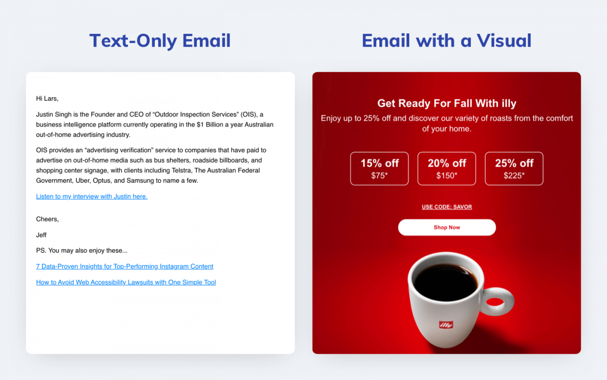
Chances are you picked the email design on the right. Most people would, too, simply because it’s visually appealing.
Your mailing designs need to include visuals to get more chances to engage recipients and sell.
Here’s a bunch of email design tips to keep in mind when creating high-converting messages with visuals.
- Optimize the image-to-text ratio. Image-only email designs are highly likely to trigger spam filters. Make images less than 50 percent of all content
- Keep images at least 600 pixels wide. This width meets the requirements of most email providers and keeps image viewing quality high
- Use the best formats. PNG, GIF, and JPEG. PNGs are the best quality-wise; JPEG have lower sizes; GIFs allow animated images
- Add personalized images. For marketing emails, use images of products that customers are likely to be interested in.
And here’s the best news.
Creating great email designs with images is easy.
An email marketing tool with an editor such as Tidio Email Marketing is a good example. It has email templates you can customize and save tons of time.
Here’s how you add an image in Tidio’s email designer.
Simple and easy.
That’s how businesses like yours can turn the email campaign design process into a walk in the park.
But this isn’t everything.
You need to remember to optimize your images for size and weight.
Finally, here’s a couple of ideas on why and when to use animations in your mailing designs:
- Draw attention to a call to action
- Show how a product works by displaying it in use, etc.
- Display multiple products from one collection
- Highlight an announcement
- Preview video content
4. Email Copy
In the context of designing emails, you can’t simply skip the heart and soul of every message—copy.
Yes, there are numerous books on the subject, but here’s a couple of handy email design guidelines to keep in mind when writing copy:
Use One Topic per One Email
Keep every email focused on one topic.
If you want to give a discount code, don’t squeeze in things like a new collection or a special newsletter edition. Too many topics will overwhelm the recipient.
Be Short and Concise
To avoid having your emails ignored, try making every sentence as simple and short as possible.
- Say what you want right away. This will help to convey your message before a recipient gets bored and leaves the email
- Use the five-sentence rule where possible. How about only five sentences for an email text? This is a perfect amount to avoid boring the reader
- Revise for clarity. Write a message, then leave it for a while. Come back to it in a few hours. Ask yourself: “How clear is it? Do I understand what the email is trying to convey right away?”
Use Headings & Subheadings
They are great to differentiate multiple marketing messages and keep the text easy to read.
Check out this message from Chegg.
It describes product benefits with heading and multiple subheadings.
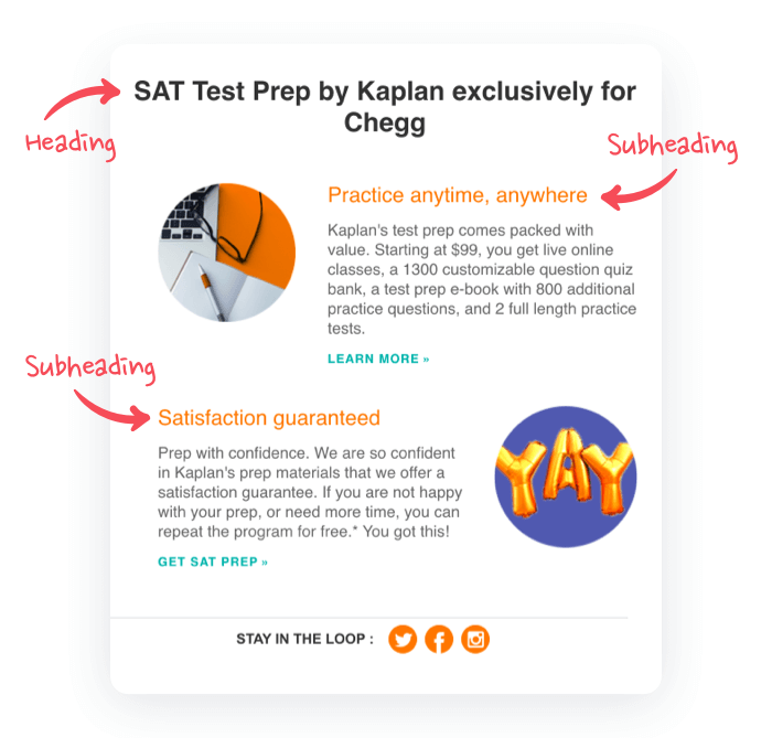
Think of these as “attention hooks.”
The main heading is for grabbing the attention right away, and the subheadings are for drawing the viewers in deeper.
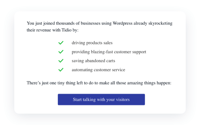
5. Email CTA Buttons
What are the best email designs?
The ones that sell.
And no message will ever sell without a call to action (CTA). Your CTAs must be:
- Visible. This means it’s sitting on a contrasting background and has a color that makes it stand out from the rest of the content
- Compelling. Instead of generic, spammy words and phrases, it needs to have action words
- Benefit-oriented. Give email recipients a good reason to click the CTA by mentioning a benefit in CTA copy.
Here’s an example of a CTA button design that’s easy to spot and read, and conveys a clear benefit.
Remember—
Email designs might have several CTAs to boost your chances of converting your readers.
6. Email Typography
Even the most compelling email campaign design will get ignored if the message is illegible. To avoid this, go for standard and readable fonts supported by all email providers.
These include:
- Arial (used by Gmail)
- Arial Black
- Georgia
- Tahoma
- Times New Roman (used by Microsoft)
- Verdana
- Helvetica (used by Apple)
And don’t go overboard with the font size. The “Goldilocks” proportions are 36 points for headings and 18 points for the body text.
Obviously, you can adjust these sizes in your email marketing tool and see how they work for your specific email design.
Most email platforms limit you to a handful of web-safe fonts for a reason: custom fonts tend to break across email clients. Flodesk solves this with patented layout technology that renders custom fonts consistently across Gmail, Apple Mail, Outlook, and mobile — so your brand typography actually shows up in the inbox. It’s designed for small businesses and solopreneurs who want their emails to reflect their visual identity without needing a developer.
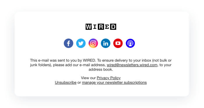
7. Email Footer Design
The best email template designs have three footer elements:
- Legal information. The full address of the company
- Unsubscribe option. It’s required by email marketing regulations
- Social media links to your business. To encourage recipients to connect with your business
Take a look at this footer from WIRED.
Looks clean, organized, and is easy to read. Perfect.
Want to know how to create an email footer for a business email? We’ve got you covered with this professional email signature guide.
Best Email Design Gallery: Inspirations and Examples
Now, let’s see how brands use email design best practices to sell.
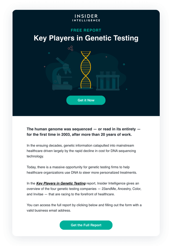
1. Business Insider
This simple, single-column email layout design is perfect for creating a newsletter.
The dark section on the top summarizes the purpose well and has a CTA if the recipient wants to download the report right away. The text below is concise and also provides another CTA—one more chance to capture a lead.
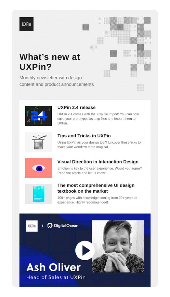
2. UXPin
This newsletter email design example is complex yet super clean.
It squeezes in multiple content types—a video, a few blog posts, and a product announcement while staying fairly readable.
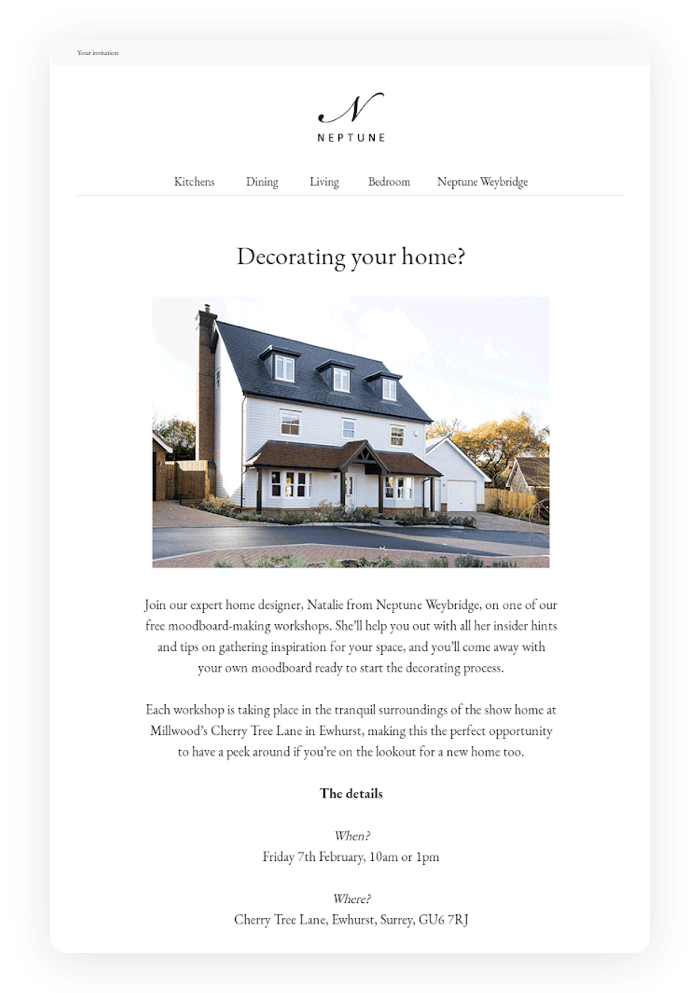
3. Neptune
This example exhibits one of newsletter design best practices—masterly use of white space.
Paired with the elegant Georgia font, it gives the message a nice, “classy” feel to it.
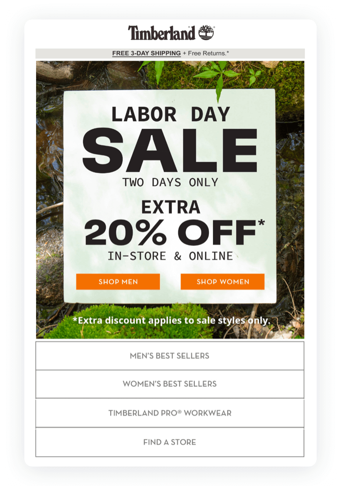
4. Timberland
This email design puts a heavy emphasis on the headings and subheadings.
It’s a great technique to make offer details stand out. That also makes this email design a nice example of the “one topic per one message” rule.
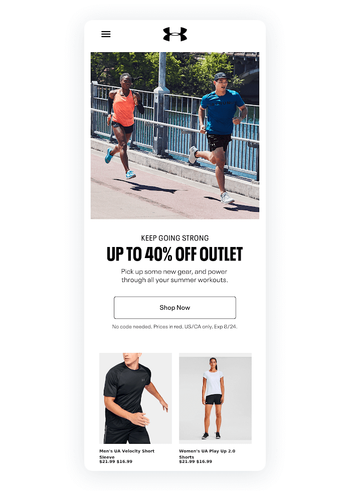
5. Under Armour
This email design has a multiple-column design to showcase a range of products.
It captures the attention with the image on the top. Below, there’s a nicely structured design with a concise copy, a stand-out heading, and lots of white space.
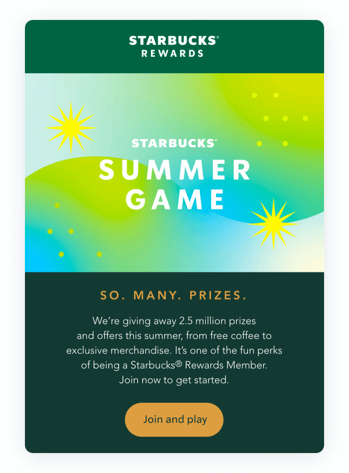
6. Starbucks
Unique visuals are a good way to improve marketing email design.
Starbucks, for example, emphasizes quality visuals and colorful backgrounds. This email design decision helps to stay within their branding guidelines.
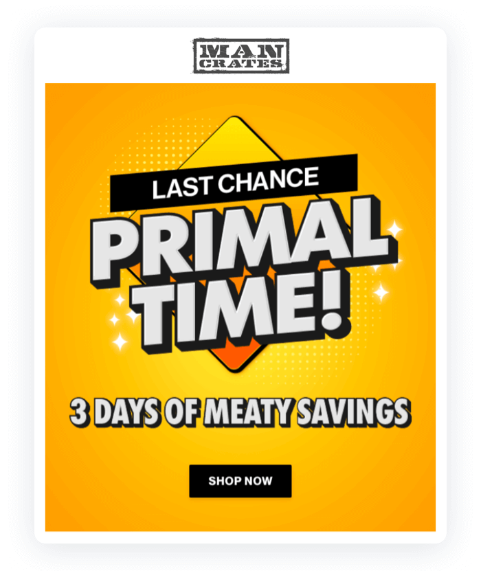
7. Man Crates
If your brand color palette is bright, check out this bright-colored email design.
The bright background makes the marketing message stand out and directs the recipient’s eyes straight to the content.
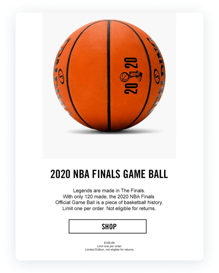
8. Spalding
Simplicity at its best.
To promote a special product, this email design has only one image, one headline, one description, and one CTA button. This ingeniously simple yet strong concept keeps the reader focused on the main message.
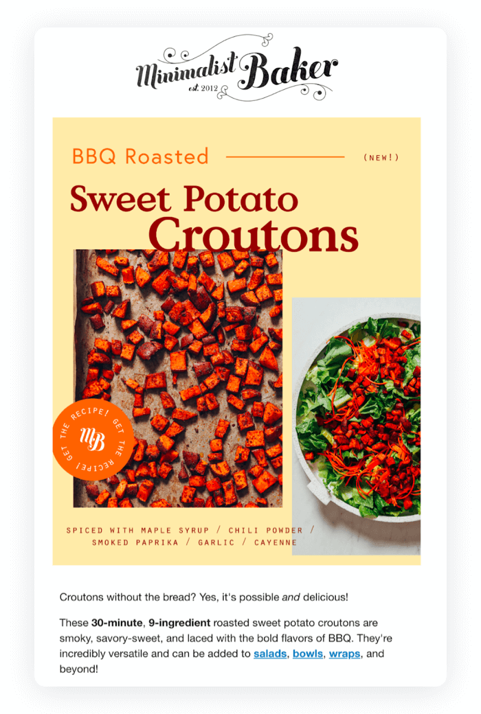
9. Minimalist Baker
The central focus of this email template design is the stunning imagery.
They’re doing a great job tempting the readers to check out the recipe. To encourage the reader to click even more, there’s a concise copy below the visual.
Overall, the email is imagery-based, which gives the design a modern and cool look.
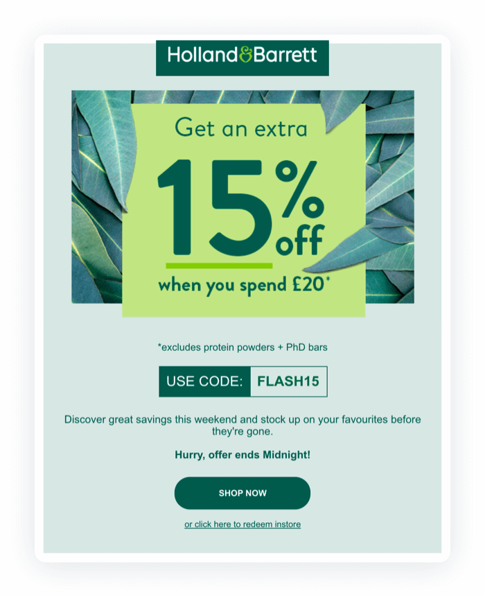
10. Holland & Barrett
This email design uses animation to focus the attention on the message.
A fun and creative animation beautifully conveys the offer. Combined with a memorable design, this email does a great job motivating the recipient to act.
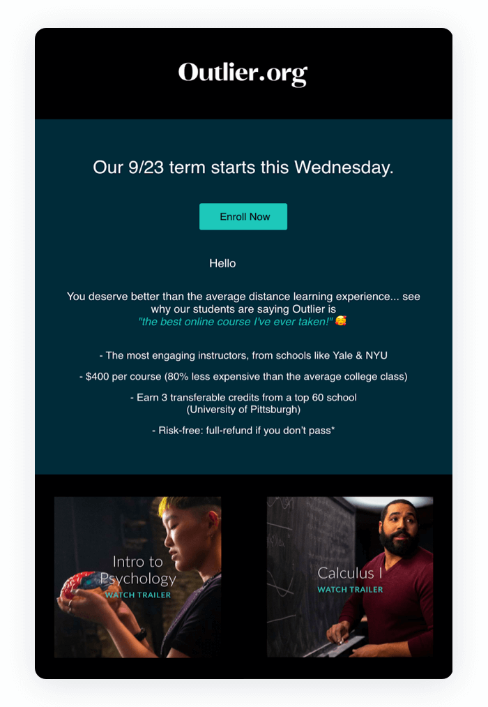
11. Outlier
The contrasting background gives this email design a super elegant and sleek look.
Using a black background, white text and colorful imagery is a great idea to make an email stand out. Although the structure varies, the message stays on point and interesting.
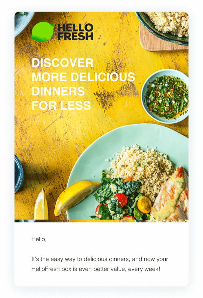
12. HelloFresh
This email design example perfectly balances text and image content.
The recipient first sees a stunning image with a heading describing the main value for them. Below the image, they can get more details about the offer. The most important proposition—“55 percent off 2 boxes”—is in bold to make it easy to notice.
Also, note a benefit-driven CTA with “Get Your Discount” as copy.
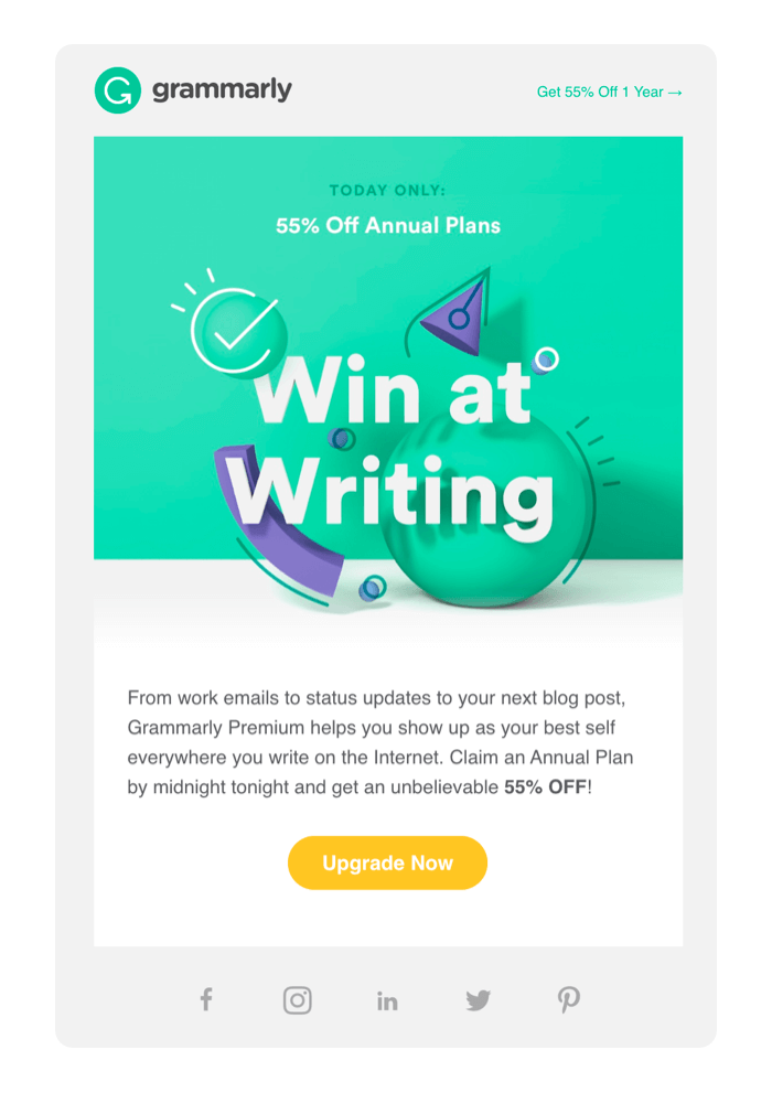
13. Grammarly
Although simple and minimalistic, this email design still manages to be inviting and interesting.
The graphic at the top is a unique touch and the brightly colored CTA button adds playfulness and dimension. Overall, the alignment of all elements gives this example a harmonious composition that invites the recipient to take a second to appreciate the design.
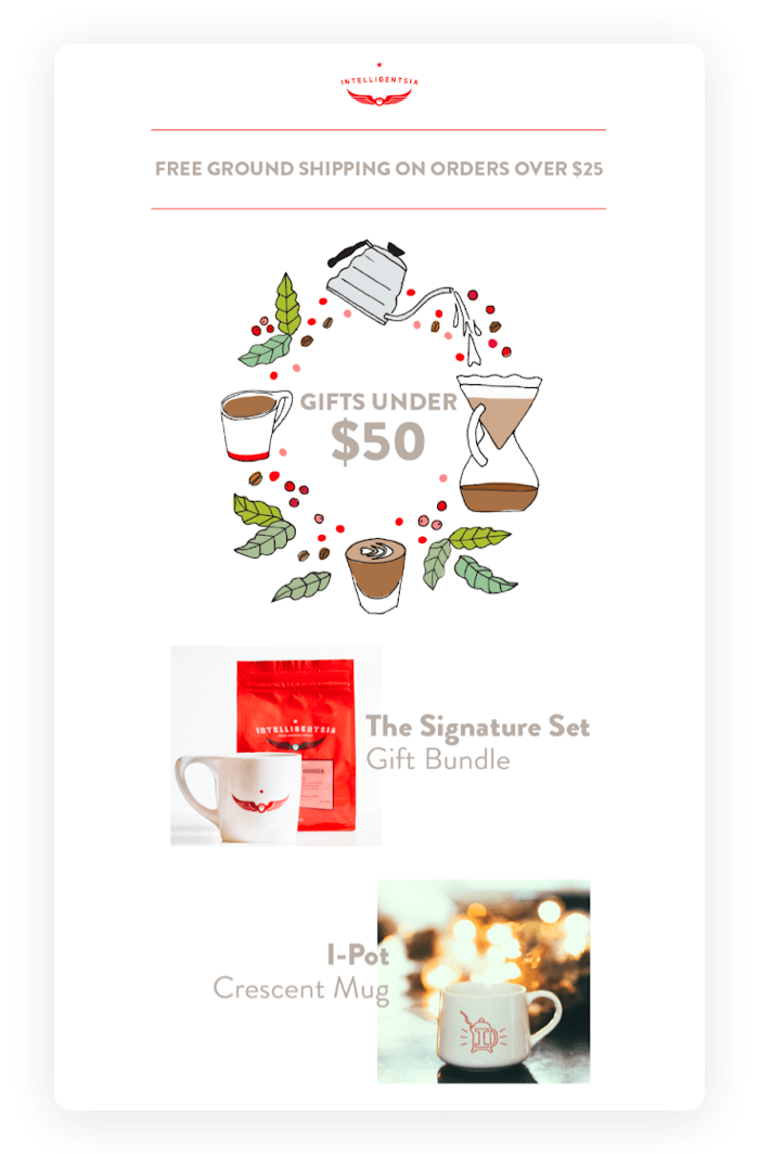
14. Intelligentsia Coffee
Want to get artsy in your email designs? This one is a good example.
A simple but inviting graphic at the top introduces the main message beautifully. The content sections are listed horizontally. This structure is a good design technique to display multiple messages at once, each with equal importance.
15. WIRED Magazine
Simple and focused on the message—this is the theme here.
This email design uses a black background and a clear central focus on the offer. The text is perfectly aligned and placed in a way to differentiate messages.
Note how WIRED uses different font sizes and colors. This is a technique to help recipients understand what’s more or less important.
Key Takeaways
Beautifully designed, value-packed emails. This is the single most important thing to get more returns from your email marketing investments.
To create the best email designs, make sure to:
- Take care of email preview in the inbox
- Choose the best email layout
- Create stunning imagery and balance it with text
- Choose email safe fonts
- Break up concise text with headings and subheadings
- Make visible and benefit-oriented CTA buttons
- Keep the footer limited to legal information, unsubscribe, and social media links.
Now roll up your sleeves and get some practice in Tidio’s free email editor!
Generate leads for your well-designed emails