What is the first thing that pops into your head when you hear a company name?
I’m betting it’s either one of its products or its logo.
There are many logos that are very simple and yet extremely powerful. But what makes a logo design good or bad? And how to design your own logo?
In this article, we will show you:
- How to create memorable logos that match your business
- What resources and tools you can use to design your logo
- Examples of good and bad logos
If you want to fine-tune your marketing strategy before designing your logo, you may also be interested in:
Learn how to use the power of AI and automate your customer service
Here is our step-by-step guide to designing a logo for your business.
If you’ve never designed a logo before, follow these guidelines. Even if you can’t draw, you don’t need to worry. A good logo design is 95% about thinking and making decisions. The remaining 5% can be handled with online tools.
How to make your own logo:
- Decide why you need a business logo
- Define your brand identity
- Find inspiration among your competitors
- Consider different logo design styles
- Pick colors that match your company
- Select the right typography
- Use free resources and tools (e.g., free vector graphics software) to prepare the design
- Incorporate your logo into your brand
If you want to discover how to create a logo, read more about each step of the process.
1. Decide why you need a business logo
It seems obvious that businesses, personal brands, and rock bands need logos. But it’s a good idea to take a step back and try to think about it for a while.
A great logo design is memorable, it communicates values, it encapsulates the personality of your brand. But sometimes it can also hint at what type of product or services you are selling.
To design a good logo you should try to answer the following questions first:
- In what situations will my company logo design be used?
- Will designing a logo give me any advantages?
- Is the logo design supposed to grab attention?
- Do I need to explicitly show my products or items related to my profession?
Let’s suppose that you are selling hot dogs. It may turn out that the primary purpose of your business logo is to make it clear that you are selling hot dogs at your hot dog stand. This core objective will determine all subsequent logo design decisions you will need to make.
But—
How to make a logo that shows everything you want to show without being blunt?
Here are some more examples of good logo design:
- The logo of Tour de France has a figure of a cyclist made out of the OUR letters
- The letter P used in the Pinterest logo is a pin
- The arrow in the Amazon logo shows that they have everything—from A to Z.
You can find more interesting types of logo design and their meanings here: Famous logos with hidden meanings
Still not sure what your business exactly is, let alone why it needs a logo? If you are just thinking about starting your company, here are some good small business ideas for 2021.
2. Define your brand identity
Let’s take a quick look at what probably is the most famous logo in the world.
The famous shape used by the sportswear company represents speed, power, and victory—all of which are close to the heart of every aspiring sportsperson.
If you concentrate hard enough you can even hear it. It goes swoosh!
Now—
What values do your customers believe in?
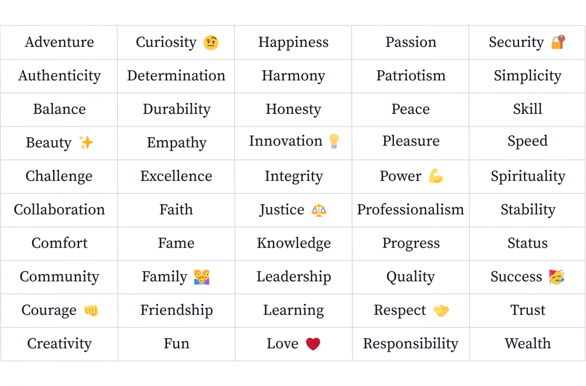
Here are some of the core values that customers associate with their favorite businesses:
If you don’t know how to make a logo that communicates the right values, follow the formula below.
You should pick 3-5 values that your products or services are connected with. Note them down. It will help you determine your brand identity.
The next step is to decide how to represent those values in a visual way. You can use symbolism that will be recognized among your customers or something that appeals on a more intuitive level.
Take a look at these logo design examples:
- A horse can be easily read as a symbol of speed, elegance, power, and beauty. Because of these qualities, it is used by Ferrari.
- A puma represents challenge, courage, speed, and a little bit of danger that you need to overcome. That’s why it is a great match for Puma—the sportswear brand.
- The bitten apple used by Apple is a symbol of knowledge that alludes to the biblical myth of Adam and Eve.
Do you need more information on symbolism? To find out how to design company logo elements with “hidden” meanings you can visit this article: The Power of Symbolism in Logos
3. Find inspiration among your competitors
Designing a logo is not writing an exam. There’s nothing wrong with peeking.
Go through your competitors’ websites and social media profiles to see what kind of logos are popular. See how the quality of designs correlates to the number of likes.
Also, try putting yourself in the shoes of a customer and think which company you would choose based on the look of the logo alone. Choose your favorites and see if there is some kind of shared component or quality to them.
Are they linked with a similar value or theme? Are they using similar colors or typography? If they are, it probably means that it’s a good choice. Good design is always all about creating something new from recognizable and proven elements.
Google, Pinterest, and Shutterstock are your best friends. You can find inspiration even if you need something very specific. You can search for a modern craft beer logo or lettermark logo for a law firm and explore thousands of examples to find inspiration. When exploring web design Inspirations for law firms, paying attention to typography and navigation structure can help ensure the site remains professional yet user-friendly, which is crucial for legal websites.
Check different results for robot logos in some popular libraries and best logo design tools:
Try using their search engines to find more examples of logo designs based on your preferences.
Logo Design Tip
Some types of businesses have it easier than others. For example, if you are running an online store on Shopify, you can use a logo maker powered by Shopify. Check out how to start selling on Shopify.4. Consider different logo design styles
Company logos come in all shapes and sizes. But if you have followed our instructions and defined your brand identity, you shouldn’t have any problems with finding the appropriate logotype.
A logo design can be:
Does anything strike a chord?
At this point you can be like: That’s it! I need a vintage emblem logo that will show my appreciation of tradition and quality!
But it’s perfectly fine if you are still toying with different ideas and styles. We are getting closer and closer to designing a perfect logo for your company.
Here are some more good examples of logo designs that you may find inspiring.
These companies for sure know how to design a good logo and it’s worth studying them before you make your own.
Some of the most popular logos are based on animals, people, plants, inanimate objects, natural phenomena, or can be completely abstract.
People who don’t know how to make a business logo usually opt for mascots or objects related to their industry. However, you should be careful.
Logos that have mascots or recognizable objects seem to be more memorable but actually, they are an exception to the rule. Only 13% of the biggest brands in the US have any kind of figurative representation of an object, animal, or person in their design. We checked (and we even counted the four squares in Microsoft’s logo as a representation of a window).
5. Pick colors that match your company
There have been countless studies produced on the topic of color psychology. Some of them analyze it in the context of shopping. Other studies focus on physiological reactions to specific color wavelengths.
Take a look at the infographic below to decide what’s the right color for you.
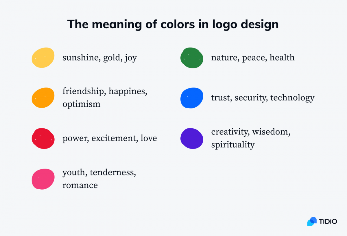
Don’t want to trouble yourself too much with picking colors? Then you should know that blue and red are the most popular and universal options.
If you were to take a look at the logo designs of the 100 most valuable brands in the US, you would discover that:
- The color blue is used in 39% of the designs
- The color red is a close second as it appears in 37% of logos
- One in four logo designs has yellow, gold, or orange accents
The most common type of logo is a name coupled with a blue or a red brandmark.
Here’s the logo of our company. It is a classic combination—a black font and a blue symbol.
And here’s the Heineken logo:
One more perfect logo design that uses this formula is Walmart:
The majority of companies use up to 2-3 different colors that match their brand identity. There are all kinds of color combinations but high-quality logos use extremely limited color palettes.
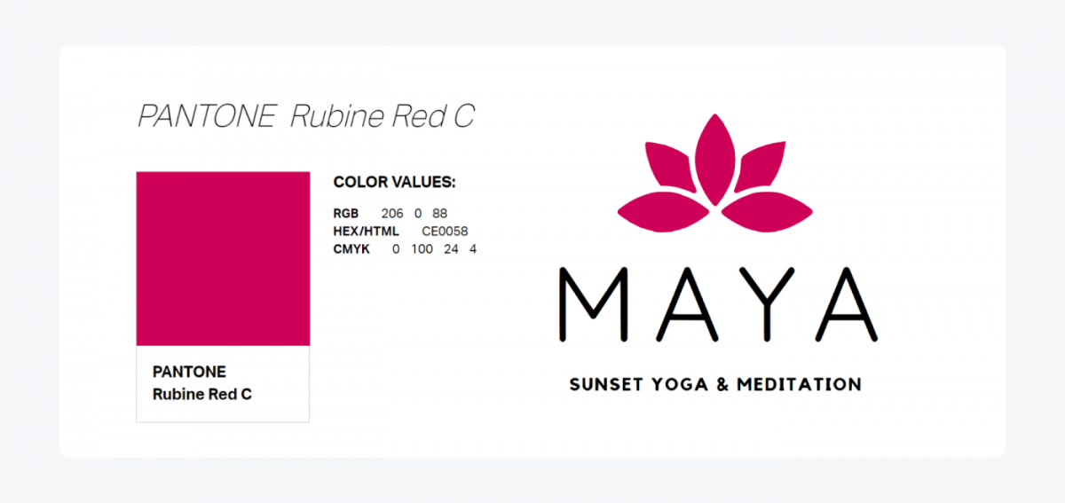
When you decide on the colors of your logo, make sure to use them consistently. It means that you need to determine their specific color values. The most widely used color systems are:
- Pantone
- CMYK
- RGB/HEX
For example, the primary color used in your own logo design can be PANTONE Rubine Red C and its corresponding values for CMYK printing and RGB screen display.
Logo Design Tip
Instead of picking isolated colors, you should consider using one of the popular color palettes. Some color combinations work together really well while others bring mixed feelings to some customers. Here are some useful AI generated color palettes based on current design trends.6. Select the right typography
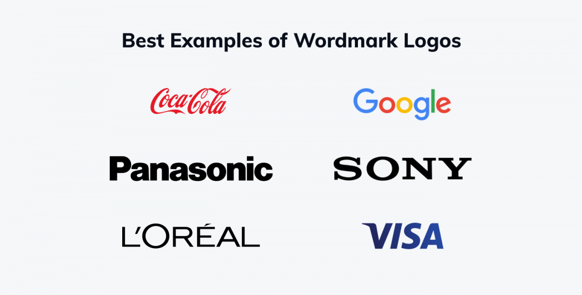
In the world of logos, sometimes typography alone gets the job done. Take a look at these examples:
Certain fonts can evoke different moods. If you want, you can read a 600-page dissertation on the psychological impact of typography on the perceived level of trustworthiness or professionalism.
The Coca-Cola font is very festive and ornamental. Google looks playful and inviting. Visa looks sturdy and reliable but at the same time there is a small hint in the letter V that your payments are going to be fast and smooth.
Once again, the type of font that you choose is crucial. There are many brand marks and company names that seem to look fine in isolation. But, once you put them together, something doesn’t feel right. They don’t click.
How to make logo typography work to your advantage?
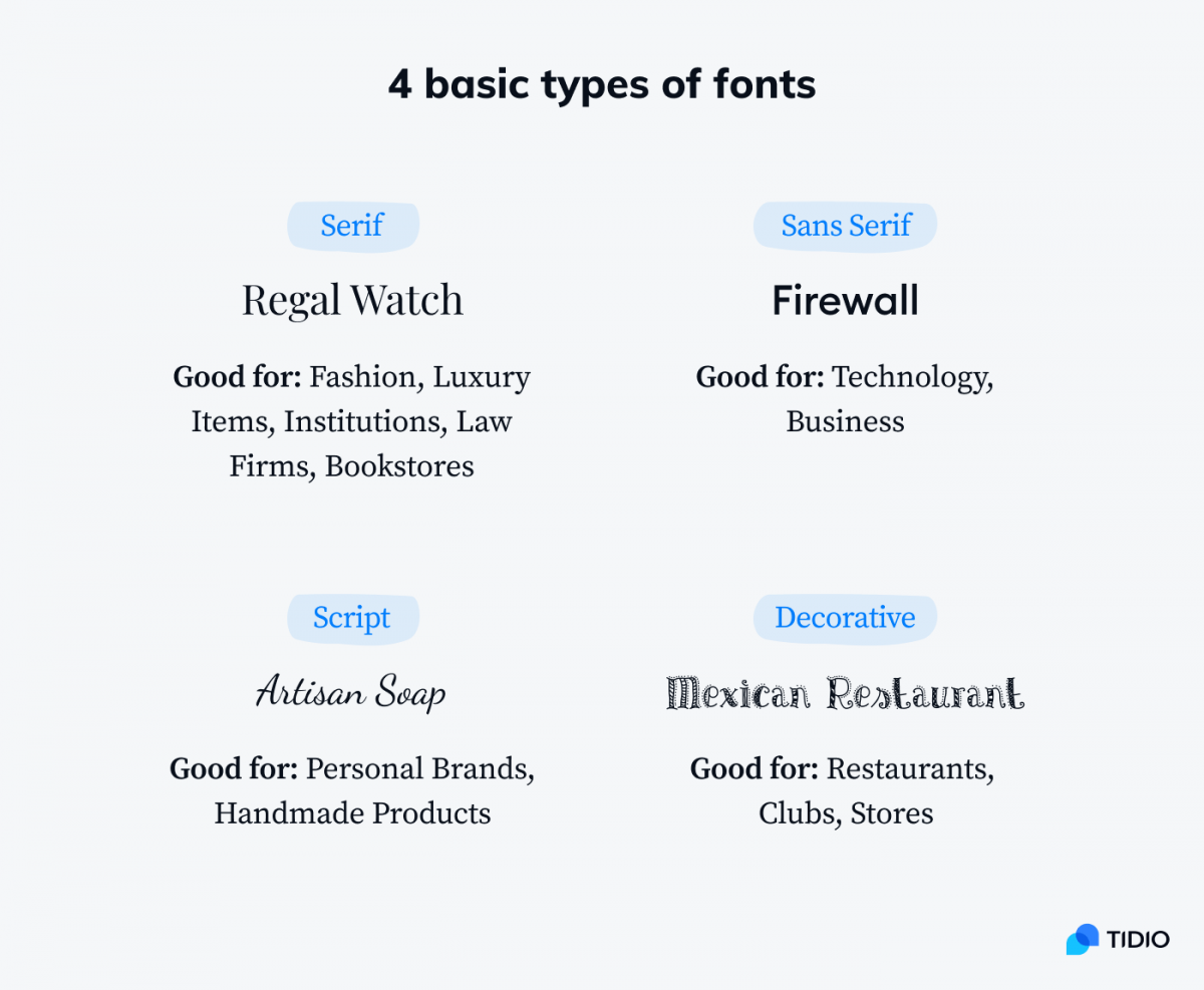
Here are the 4 basic types of fonts to consider in your logo design:
Here are some useful resources if you need free fonts for your logo:
7. Use free resources and tools to prepare the design
By this time you should know:
- If your logo should have a brand mark (like the Old Spice ship) or just use the business name/wordmark (like Gillette)
- What kind of object or shape you intend to use as your brandmark to express your company’s values or brand personality
- In what kind of situations and on what materials you’ll put your logo
- What will be the colors of your logo design
- What are the most common types and themes used by your competitors in their logos
There are different ways to approach the process of drawing your logo. The end result should be a scalable vector illustration with all design elements saved as Bézier curves (for example a SVG or EPS file). However, the way you start is up to you. If you need a starting point, browsing logo templates can spark ideas and give you a feel for what works before you start from scratch.

How to create logo designs efficiently?
You can:
- Option A: Sketch it on paper, take a photo, and then trace it in Adobe Illustrator or Inkscape
- Option B: Start with arranging random shapes in your vector graphic design software
- Option C (a shortcut): Download an existing free logo or its elements from libraries like Pixabay and modify it by editing paths (make sure that they are free too remix and don’t require attribution for commercial uses)
Try to create different variants of your logo. Play around with different fonts and element arrangements.
The most popular logo makers for beginners:
If you’d rather have a logo designed for you rather than make a logo yourself, you can always visit such websites as Fiverr and find someone who’ll do it for you at an acceptable price.
8. Incorporate your logo into your brand
Your logo design should be an essential part of a whole visual system that your business will use. Professional logo designers always look at the big picture.
Different types of logos look better or worse in specific contexts.
Does it need to look good on posters? Is it supposed to become a part of your product like the Mercedes-Benz three-pointed star on their cars? Do you want collega kids to tattoo it on their forearms?
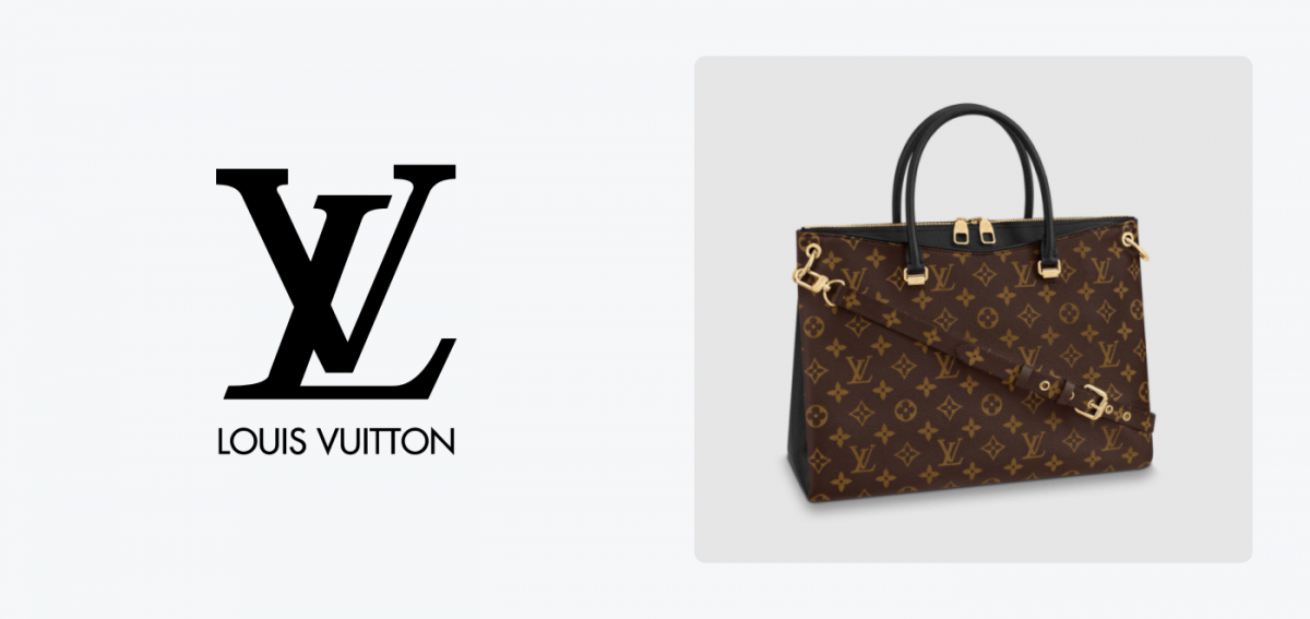
Professional logo designs may appear very simple but they look great as reliefs, in black and white, or as elements of larger designs. For example, the Louis Vuitton monogram is not a particularly memorable symbol in itself. But take a look at the way it is used. The pattern is iconic.
Some logos look unimpressive until you see them on golden buckles. There are logos that are meant to be experienced in full size while others were designed to be instantly recognizable as tiny icons on a computer screen.
Bonus: good logo design & common logo design mistakes
Let us compare two craft beer logos. Both are emblem logo designs with a mascot. There are, however, some obvious differences.
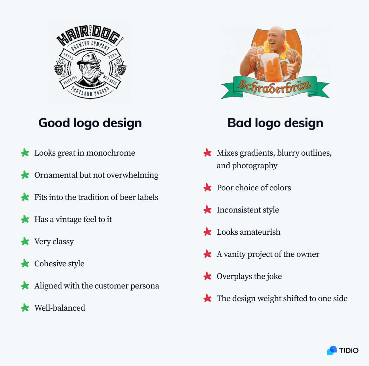
While the Schraderbräu logo (from Breaking Bad) was meant to be a joke, it has all the makings of a bad logo. Obviously, it works in the context of a fictional joke brand. But unless you are a celebrity who can tease their fans, it’s better to avoid bad design choices.
Here are some of the most common mistakes you can make while designing your logo:
- The logo is too complicated and it looks terrible when displayed as a smaller element
- Your typography and brandmark don’t match and they evoke contrasting feelings
- Your logo uses too many different styles, for example by mixing realistic drawings with vectors
- It uses too many colors—you should limit yourself to 2-3 colors max
- The colors are used inconsistently and there is no official RGB/CMYK values assigned to them
- You used a free logo maker to create a logo that is too generic and bland even for a small business
- You saved your logo as a JPG/PNG file instead of a vector file and now you can’t edit it or scale it up—and every time you need to prepare new materials you have to trace it all over again
- You logo is unintelligible or it can be interpreted as something offensive or sexually suggestive
Here are some bad logo design examples:
If you are curious enough, you can find more logo design disasters here: 35 Worst Logo Designs in History
Key Takeaway
Designing a logo is a complex process, but if you break it down into steps it will be much easier. The “how to create a logo” formula we presented is the universal way used by professional graphic designers.
The key element is not just drawing a logo, but doing proper research and thinking about possible things you want to communicate to your customers.
So—
How to make a good logo?
Remember about the following aspects of your logo design:
- Your story and values that your business stands for
- The choice of logo elements that convey the right message
- Typography that corresponds with the brandmark
- Using color psychology and limiting your palette
- Considering different contexts in which the logo will appear
- Researching your niche and competitors
- Choosing tools that are easy to use and appropriate for your skills
If you’re just designing a logo for your business, make sure to add a live chat to your website once you launch. It’s one thing to communicate with customers through the complex symbolism and psychology of color and another to actually talk to them about their needs and problems.
Learn how to use the power of AI and automate your customer service