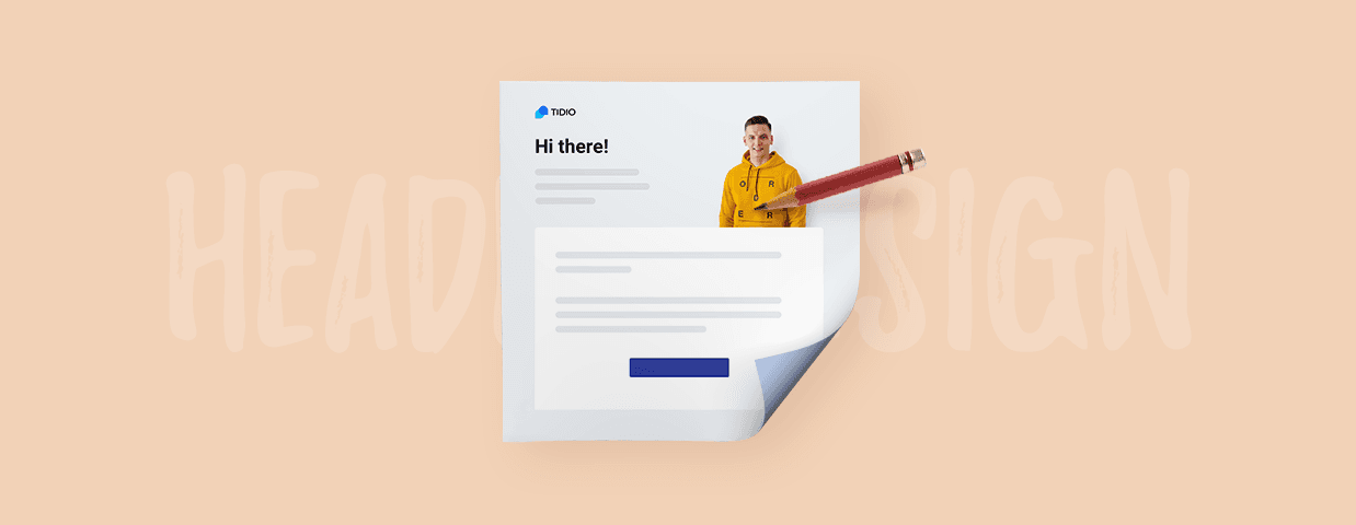
Email header design is a form of art. Making a perfect email that stuns your customers is a dream of every marketing expert. Best emails, quite logically, need to have the very best email headers.
An amazing newsletter header can make people fall in love with your visual style, visit your website, and even share their love with others. However, a stock image and template design may not cut it.
Read on to learn how to create awesome email headers and email designs that will strike a chord with your audience.
- What Is the Header of an Email?
- Email Header Examples
- How Do I Create an Email Header and Footer?
- Tips for Designing Good Email
Collect leads quickly for your next email marketing campaign
Want to explore other email-related areas? Have a look at these articles:
- 25 Customer Service Email Templates [+Best Practices]
- 5 Easy Steps to Build an Email List from Scratch [for Free]
- How to Create a Professional Email Signature [Tips & Examples]
- 10 Best Email Marketing Templates [Free Download]
- How to Write Email Subject Lines to Boost Open Rates [Examples]
- Free Email Newsletter Templates & Examples
- 20+ Best Email Opening Sentences & Greetings [Email Starters]
- How to Write a Professional Email [Email Format & Examples]
- Best Time to Send Emails: What Studies & Practice Tell Us
What Is the Header of an Email?
Technically speaking, the email header is a piece of HTML code that contains authentication signatures, similar to how JWT tokens work on the backend. This header is not visible to recipients.
Regular emails usually are just plain text and images. Conversely, professional emails, used in marketing campaigns, are more advanced. Marketing specialists, graphic designers, developers, and copywriters create the copy and the graphics that are composed and coded in HTML/CSS.
The email building blocks are:
- Email header
- Main body
- Email signature
Today, some marketing emails could be compared to landing pages of a website – what makes them emails is that you access them through your inbox, and they are delivered to your email address.
Email headers should not be confused with email preheaders. Preheaders, also known as Johnson Boxes, are short messages that appear next to the email subject line.

A preheader is the short email excerpt next to the subject line and email address. Preheaders summarize the contents of an email message. Usually, it is a fragment of the very first sentence of a message, but you can also set them up manually.
Email Header Examples
Email headers come at the very top of emails.
The best way to use them is to provide the context for the email main body. For instance, if you want to send a marketing email about new products available in your online store, you can introduce the products in the main part of the email and a company header with your business logo, or even a minimalistic menu.
A logo is an important part of your brand image. Learn how to make a logo that’s visually pleasing and communicates the right values.
Sephora Email Campaign
This email header from a Sephora email campaign has a logo/company’s name, a menu, and it blends into the main body (a list of new products with links to specific product pages) with a headline (Hey Good Lookin’) and a CTA (Shop Now).
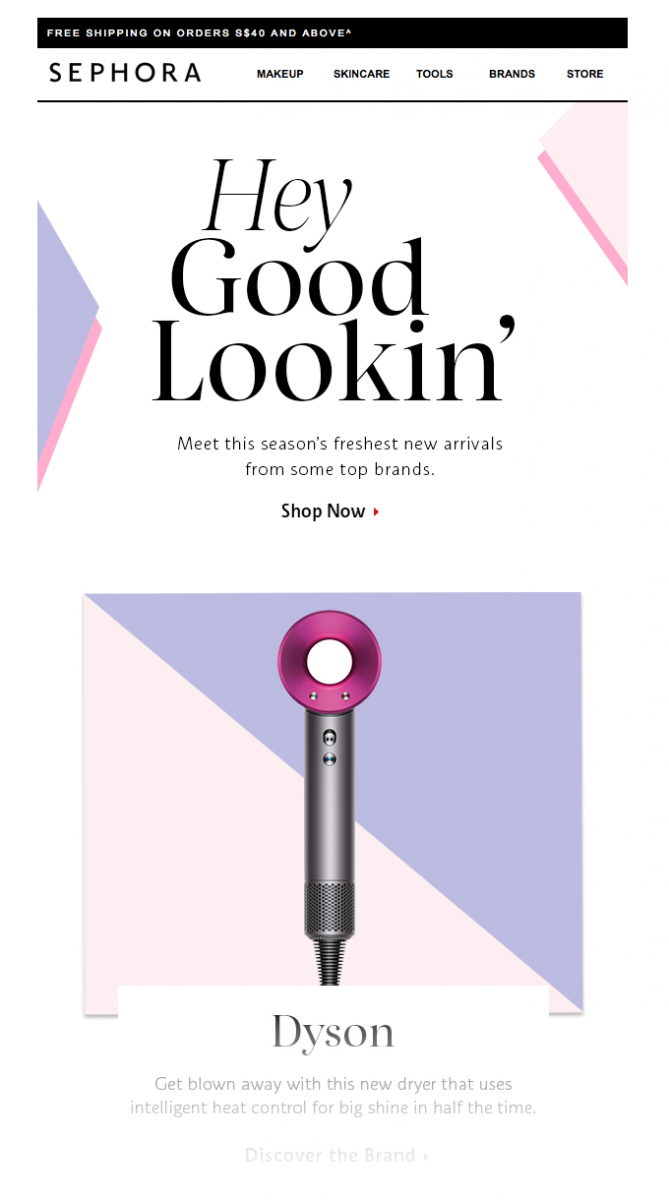
A compliment used as one of the first and most important messages combined with a Call To Action button is a well-known formula in email marketing that never fails.
Sometimes, when an email is directed at existing customers and you don’t want to distract them too much, you can stick with the logo alone in some designs.
Short Email Header Example from Hertz
This Halloween email from Hertz car rentals is short, funny, and to the point.
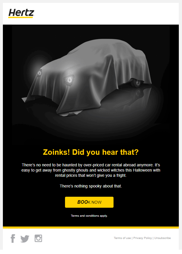
Because of that, the “headline” is moved lower and used as the caption of a ghost-car image. The header is just the logo and social media icons are located at the bottom as the email footer.
Email Header as the Most Important Point of Email
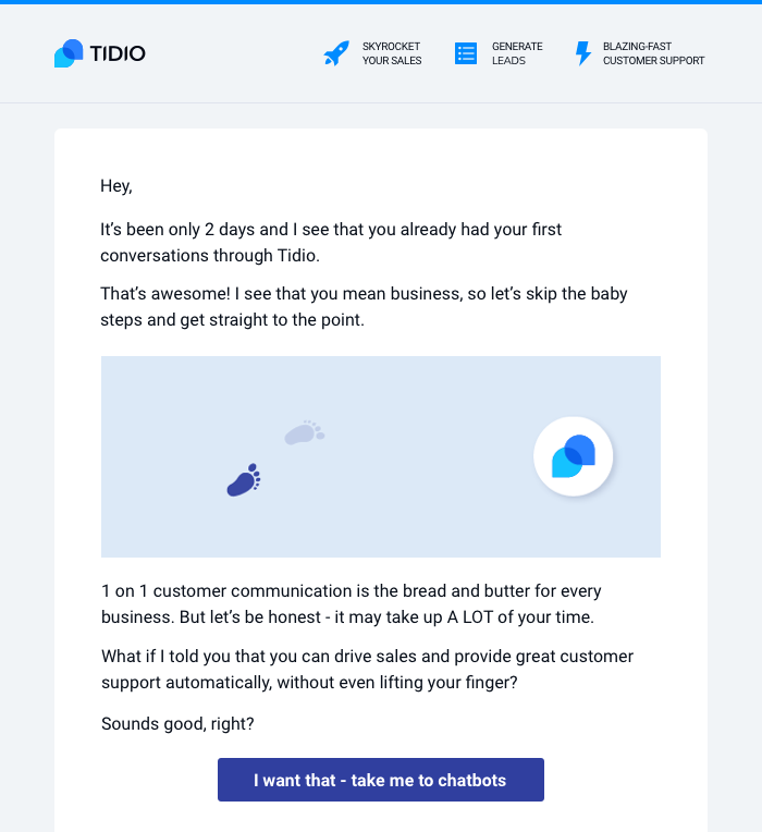
Now, take a look at one of the emails sent by Tidio.
In a manner similar to the previous email example, it has the logo as the main element that helps the recipients to identify the brand. It also provides a context for the message. However, the headline and the most important point of this email is also included in the header section.
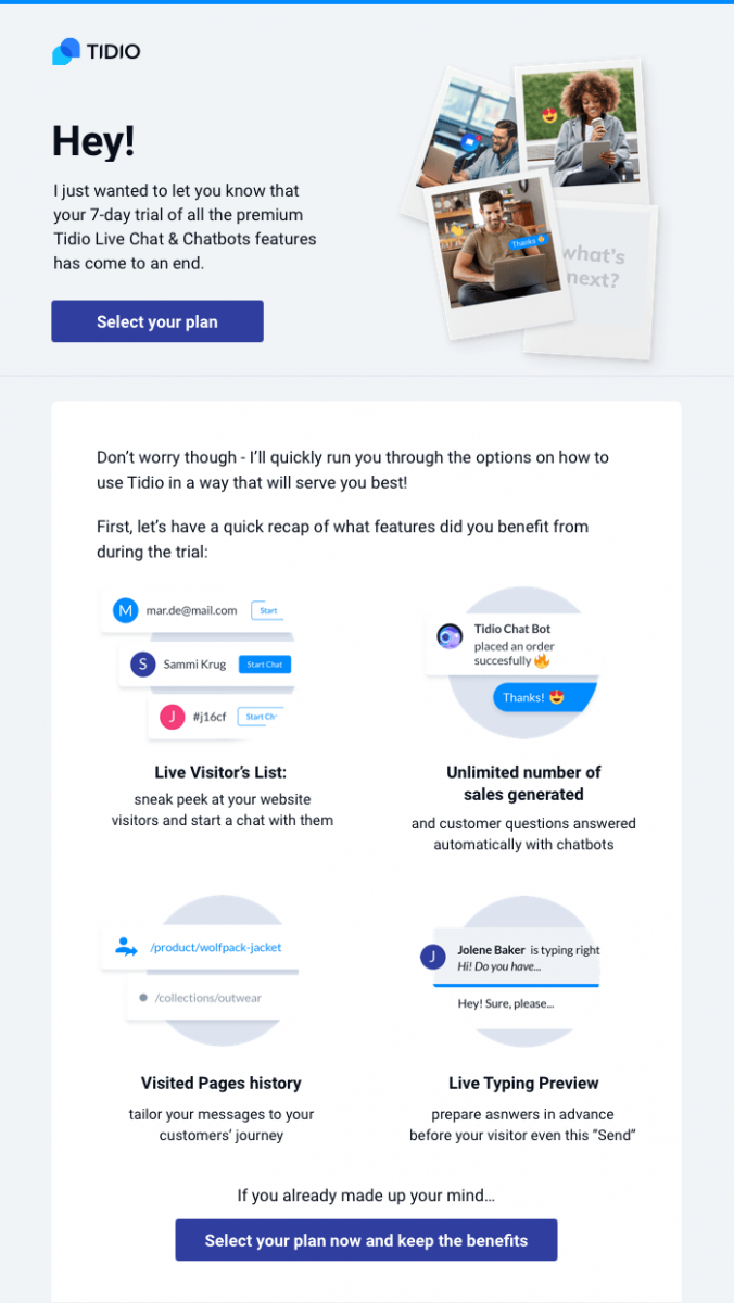
There are more details in the body, but the basic structure of this email allows to resolve the problem immediately. Users receive a notification and get a chance at taking action – they can upgrade their accounts and restore premium features with one of the plans.
All of this could be accomplished even if the email was stripped down to the header section alone. It contains all essential information, and the main body of the email elaborates on the features.
Ecommerce Email Example
Here is a different eCommerce email header example:
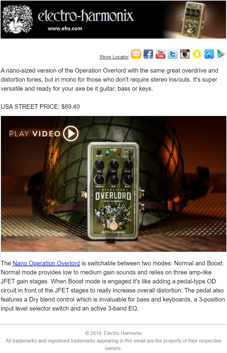
This email from Electro-Harmonix announces a new guitar pedal.
The header has a logo, a website address, and there is also a photo of the new item which matches the main content. The banner changes with every new arrival, but the layout remains very similar. Because of the nature of their stock, Electro-Harmonix also includes a Store Locator next to their social media icons – you can find where you can test their equipment.
This isn’t typical for header designs. However, because this company relies heavily on Facebook and YouTube as their primary marketing channel, social media are placed within the top part of the design. There is also an icon with the company’s email address.
How Do I Create an Email Header and Footer?
Professional emails used in marketing email campaigns are usually designed and coded in HTML. Consequently, advanced email development is no different from regular web development. Email headers (and footers) are frequently created just like website headers and modeled after them. Just like the header of a website, it can consist of an image banner/background and, in some cases, a navigation bar.
There are many tools that help to make email design easier and are extremely useful for creating marketing or business emails. Many of the email marketing platforms are equipped with drag and drop email builders. Beautiful emails, email headers, and footers can be composed in a matter of minutes from ready-made email templates.
How Do You Design a Good Email?
Designing amazing-looking emails takes skill and time. Nonetheless, there are several universal rules you can try to follow. Here is a list of best tips for email design:
- Apply the hierarchy of importance to different elements
- Use consistent style
- Employ a color palette that fits your brand identity
- Keep your email width around 600px
- Draw attention to CTA elements
- Use web-safe fonts
- Add disclaimers and unsubscribe options in the footer
1. Apply the Hierarchy of Importance to Different Elements
This rule is sometimes confusing. The phrase “make the logo bigger” has become somewhat of a meme and an inside-joke among graphic designers. Business owners want to put more focus on their brand, but it is better to approach the matter from the perspective of a potential customer. Make your compositions clear, readable, and user-friendly.
2. Use Consistent Style
You can try to experiment, but it is wise not to mix different styles. Do you know who the receiver of this particular email is? Figure out what values are important to your audience. Try to determine what qualities your design should embody. Is it elegance? Joy? Beauty? Safety? Comfort? When you decide, it is easier to use a style that works best and stick to it.
3. Employ a Color Palette That Fits Your Brand Identity
You should pick your colors with care and make sure they comply with your company’s visual identity. For instance, you may want to double-check whether your email colors aren’t too extravagant if you sell funeral home equipment or too dull if you sell surfing boards.
4. Keep Your Email Width Around 600px
Emails are displayed on different devices (including tablets and mobile phones) and in different circumstances (an email client app or a browser inbox). 600px is the most universal and all-purpose resolution for email design. However, sometimes it is better to make images bigger and dynamically scale them down to 600px with CSS.
5. Draw Attention to CTA Elements
Compose your emails in a way that makes the CTA elements stand out. Try to put your CTA buttons in the middle and make other elements of your designs naturally redirect the users’ optical flow toward them. It is a formula that many great email designs share.
6. Use Web-Safe Fonts
Emails are not like books, magazines, or posters. You need to watch out for fancy fonts, because they may not display on your recipients’ devices.
Use email-safe fonts such as Arial, Arial Black, Courier, Courier New, Georgia, Tahoma, Times, Times New Roman, Trebuchet MS, Verdana.
Other very popular fonts (that are supported by virtually all email clients) include Book Antiqua, Geneva, Helvetica, Impact, Lucida Console, Lucida Grande, Lucida Sans Unicode, Monaco, Palatino, Palatino Linotype.
7. Add Disclaimers and Unsubscribe Options in the Footer
It is essential to add disclaimers and unsubscribe options to get your messages pass anti-spam and meet local legal restrictions. However, there is no need to draw too much attention to them – they can be displayed in the footer in small print.
How Do I Make My Header Stand Out?
Practice makes perfect. You should begin by following the tricks and rules from this article. You can find many great examples online – look for inspiration and experiment, by tinkering with emailers’ templates that are shared across the internet.
Add Tidio to your marketing toolset and incorporate it into your automated customer acquisition and mailing workflow.
Collect leads quickly for your next email marketing campaign